컴포넌트 기반 개발환경(Component-Driven Development)(CDD)
- Story는 args를 넘긴 UI Component 가 어떻게 렌더링 되는지 확인하기 위한 도구입니다.
- Storybook을 정적파일로 만들어 UI 배포용 웹으로 만들 수 있습니다.
- 하나의 UI Component는 하나 이상의 Story를 가질 수 있습니다.
- 사용자 인터랙션을 작성하고 화면을 전부 렌더링 해야하는 E2E 테스트보다 간편히 Component 테스트를 진행할 수 있습니다.
- Story 파일은 개발 전용이며, 상용 번들에 포함되지 않습니다.
사용법 :
1. 기존 프로젝트에 Storybook 설치
npx -p @storybook/cli sb init --type vue
Storybook initial file tree
└── stories
    ├── Button.vue
    ├── Button.stories.js
    ├── Header.vue
    ├── Header.stories.js
    ├── Introduction.stories.mdx
    ├── Page.vue
    ├── Page.stories.js
    ├── assets
    │   ├── code-brackets.svg
    │   ├── colors.svg
    │   ├── comments.svg
    │   ├── direction.svg
    │   ├── flow.svg
    │   ├── plugin.svg
    │   ├── repo.svg
    │   └── stackalt.svg
    ├── Button.css
    ├── Header.css
    └── Page.css
2. UI Component Story 생성
UI Component 예 : Button.vue
//Button.vue

<template>
  <button type="button" :class="classes" @click="onClick" :style="style">
    {{ label }}
  </button>
</template>

<script>
import './button.css';

export default {
  name: 'my-button',

  props: {
    label: {
      type: String,
      required: true,
    },
    primary: {
      type: Boolean,
      default: false,
    },
    size: {
      type: String,
      default: 'medium',
      validator: function (value) {
        return ['small', 'medium', 'large'].indexOf(value) !== -1;
      },
    },
    backgroundColor: {
      type: String,
    },
  },

  computed: {
    classes() {
      return {
        'storybook-button': true,
        'storybook-button--primary': this.primary,
        'storybook-button--secondary': !this.primary,
        [`storybook-button--${this.size}`]: true,
      };
    },
    style() {
      return {
        backgroundColor: this.backgroundColor,
      };
    },
  },

  methods: {
    onClick() {
      this.$emit('onClick');
    },
  },
};
</script>
@/stories/{ui-component-name}.stories.js 파일 생성
// Button.stories.js
import Button from './Button.vue';
export default {
/* 👇 The title prop is optional.
* See <https://storybook.js.org/docs/vue/configure/overview#configure-story-loading>
* to learn how to generate automatic titles
*/
title: 'Example/Button',
component: MyButton,
// More on argTypes: <https://storybook.js.org/docs/vue/api/argtypes>
argTypes: {
backgroundColor: { control: 'color' },
size: {
control: { type: 'select' },
options: ['small', 'medium', 'large'],
},
},
};
//👇 We create a “template” of how args map to rendering
const Template = (args, { argTypes }) => ({
components: { Button },
props: Object.keys(argTypes),
template: '',
});
//👇 Each story then reuses that template
export const Primary = Template.bind({});
// More on args: <https://storybook.js.org/docs/vue/writing-stories/args>
Primary.args = {
primary: true,
label: 'Button',
};
export const Secondary = Template.bind({});
Secondary.args = { ...Primary.args, label: '😄👍😍💯' };
export const Large = Template.bind({});
Large.args = { ...Primary.args, size: 'large' };
export const Small = Template.bind({});
Small.args = { ...Primary.args, size: 'small' };
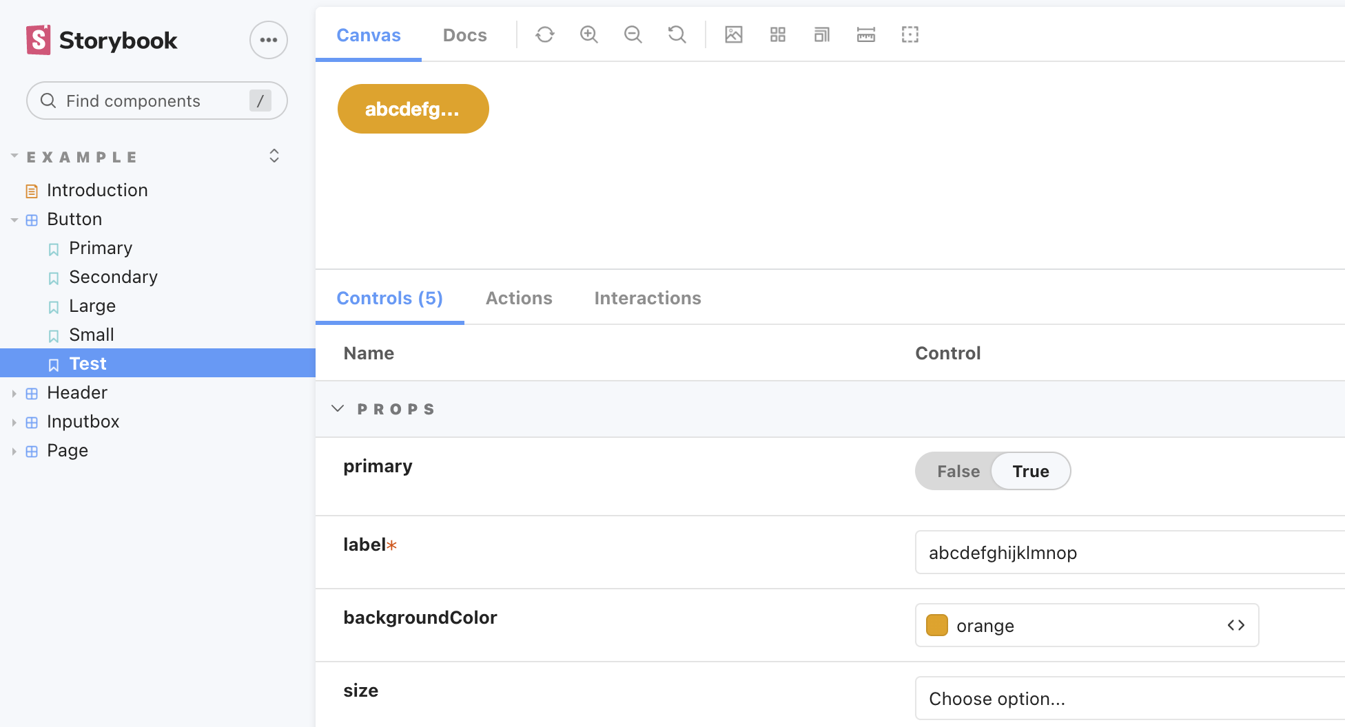
export const Test = Template.bind({});
Test.args = { ...Primary.args, backgroundColor: 'orange' }
Test.story = {
decorators: [()=> ``]
}1) 사용될 UI Component 인 Button.vue를 Story에 import 합니다.
2) `export default` 는 스토리의 설정을 나타냅니다.
- title : 컴포넌트 명입니다. / 으로 여러 컴포넌트를 그룹화할 수 있습니다.
- component : 사용될 컴포넌트를 정의합니다.
- argTypes : 컴포넌트에 전달될 인자와 타입을 정의합니다.
3) Template 함수는 Storybook 에서 권장하는 개발패턴입니다.
- 하나의 기본 형태를 선언한 뒤, Template.bind()로 새로운 함수를 찍어냅니다.
- args 를 주입하여 상황에 따라 다른 UI를 표현하도록 합니다.
4) export const 는 사용된 args 를 통해 Render 될 Component를 나타내기 위한 기능이라고 볼 수 있습니다.
기타 옵션을 통해 story가 UI 상 위치할 section을 미리 지정해 표현해볼 수 있습니다.
3. Storybook 실행
npm run storybook || yarn storybook
4. Addon
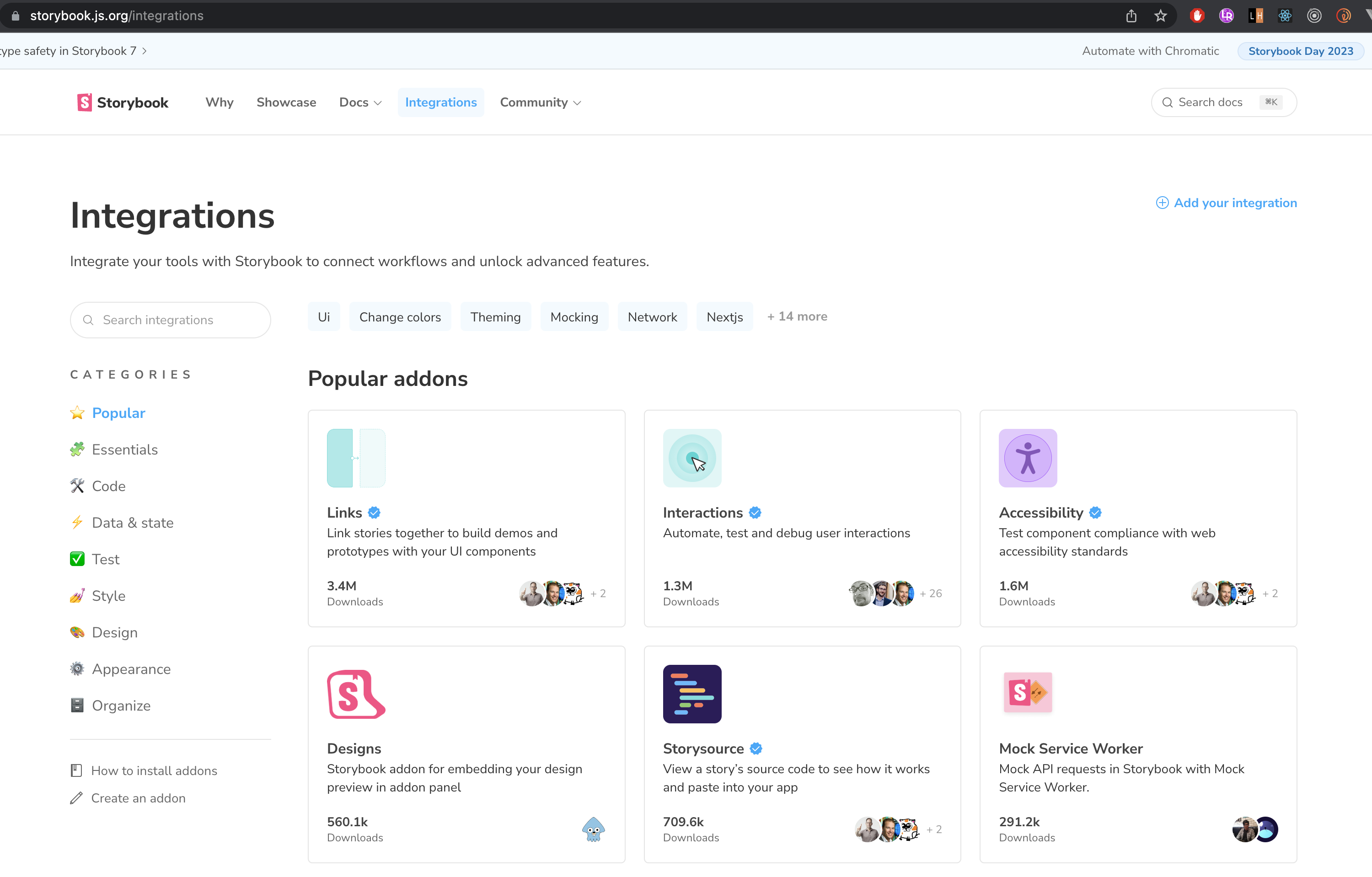
- Storybook에서 사용하는 플러그인으로 여러 기능을 확장하여 사용할 수 있습니다.
- Addon 필수기능은 default로 설치되고, storybook 커뮤니티 또는 github에서 다운받아 확장할 수 있습니다.
Essential addons
- addon-control : 인수(arguments)를 바꿔보며 컴포넌트의 동작을 탐색할 수 있습니다.
예) 텍스트가 길어질 경우 말줄임 표시가 나타나는지 테스트해 볼 수 있습니다.
- addon-action : 이벤트 핸들러를 통해 받는 데이터를 보여줍니다.
예) 컴포넌트에 정의된 click event 발생시 반환되는 데이터를 테스트해 볼 수 있습니다.

- addon-viewport : 스토리가 렌더링되는 iframe의 크기를 조정할 수 있습니다.
예) 새로운 장치를 추가해야 될 경우 아래와 같이 장치와 frame 크기를 정의할 수 있습니다.
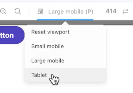
// .storybook/preview.js

const customViewports = {
  tablet2: {
    name: 'Tablet2',
    styles: {
      width: '600px',
      height: '963px',
    },
  },
  viewHD: {
    name: 'View HD',
    styles: {
      width: '533px',
      height: '801px',
    },
  },
};
Vue 에 적용시 주의할 점
- Storybook을 사용하기 위해선 Component Data fetch 와 Presentation 을 완전 분리시켜야 합니다.
- View 요소만 Storybook에서 테스트를 진행하고 로직은 Store에서 Unit 테스트가 필요합니다.
Reference :
https://storybook.js.org/docs/vue/writing-stories/introduction#using-args
How to write stories
Storybook is a frontend workshop for building UI components and pages in isolation. Thousands of teams use it for UI development, testing, and documentation. It’s open source and free.
storybook.js.org
https://ui.toast.com/posts/ko_20220111
스토리북으로 인터랙션 테스트하기
스토리북으로 자동화 테스트를 작성하는 방법, Interactive Stories 기능 등을 활용하여 컴포넌트의 인터랙션을 자동으로 재생하는 방법, 그리고 E2E 도구를 결합하여 테스트하는 방법 소개
ui.toast.com
'Front-end' 카테고리의 다른 글
| Vuex (0) | 2023.02.03 |
|---|---|
| 깃헙 웹페이지 올리기 github.io (0) | 2021.09.08 |
